Worldcup Peak Preview
The Soccer Worldcup 2010 is approaching quite fast, that’s why we don’t want to let you wait. During your waiting time, we made an App to shorten you the last minutes before the whistle. But don't worry, we would not be Pragmatic Programmers if we would just leave it by that. It's also the most easiest and exciting solution on the market, that's just made for the iPad. So why's that? Let's get out of the stash and take a look at it.
Promotion Keys: Until Saturday, 12th of July, 12am GMT we will give away Promotion Keys for Cup Planner 2010 iPad. For getting it, just write a brief Tweet to @tonqa, that you want to use „Cup Planner 2010 iPad“ and embed the link to this page. We will draw a lot on the candidates. Product Page: We made a product page, for getting more information about the content visit adamasvision.com. You can find the App on iTunes.
We are proud to present the first Worldcup 2010 App for the iPad out now. But don't worry, we would not be Pragmatic Programmers if we would just leave it by that. It's also the most easiest and exciting solution on the market, that's just made for the iPad. So why's that? Let's get out of the stash and take a look at it.

We are the iPad's first Worldcup App with a whole-screen experience, so we started out from the scratch and had a long design phase. And believe it or not, it turned out experimental. How to program something what we call a sweet solution, that's easy-to-use and useful at the same time? Why should it be outstanding of all others. By god, just use the Apple Standard Widgets, you'd say. But actually a Worldcup App is something, that Apple would call a smart tool in its developer sessions. It has to be rapid in utilization and just to be smart-looking. Something you intuitively call and start playing around with. And we wanted you to have it on the sofa at home, showing your tips and the scores to all of your friends.
Actually, we started out rather alone, on a rock with high-level view looking out for ideas. And it turned out great, we had nights of pure brainstorming with longly lacking any amounts of code. So swallow it, here's the thumb rule: A good from-the-scratch iPad App needs a 50% design phase, a 30% programming phase and at least a 20% module and acceptance testing phase. So here's how we left it and I do not bother giving an insight, you should not try to bum or skip the design phase, even if you have got just two weeks of development time (or rather just 4 days if you follow my recommendations).

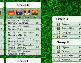
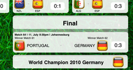
Our first design decision fitting to a whole-screen-experience was to keep out all menus entirely, cause that is what disturbs you most when planning and playing. Playing around with it should be rather a game, like soccer also is the most exciting game in the world. And, funny enough, it turned out great also for planning, you just feel like excitingly staring on the lawn, sitting directly in the hot tremulous South-African Arena.
What is just for you, and it is not graved in stone but smart it is, that we concentrated on Landscape mode right now. That's because you, the eager soccer player, wants to view the whole scoring board just in one view rather than in two. It turned out to be the most intuitive way to play around with the tipping boards. That's the way you see group tables on the TV and live tables in the Internet. And that's the way, you can put your iPad on the stand.
As you see, we just made the App for you. It's cracking good, so we want to be sure that you get it to a fair price until each team has played at least once. And sweetheart, if this is not enough for you, we will give you awesome weekly free updates until the end of the Worldcup. What's still planned is a lot, and we love to keep secrets. But one so far, we concentrate to build-in the current games team line-ups and positions of all eleven soccer players of both teams. Feel free to join the fun.
Screencast can be found here.