
Font Awesome with Nuxt.js
Font Awesome 6, which is an excellent icon library, can be used to make a page's design in Nuxt.js more usable and user friendly with a little amount of effort. It is used by millions of designers, developers and content creators and is completely free to use. It would be a pity not to benefit from it in the next Nuxt project.
Overview
Font Awesome 6 makes it even easier to use icons selectively without importing a whole library. Of the 16,150 icons, 2,016 are freely available. So it's definitely worth taking a look around on Font Awesome.
Style selection
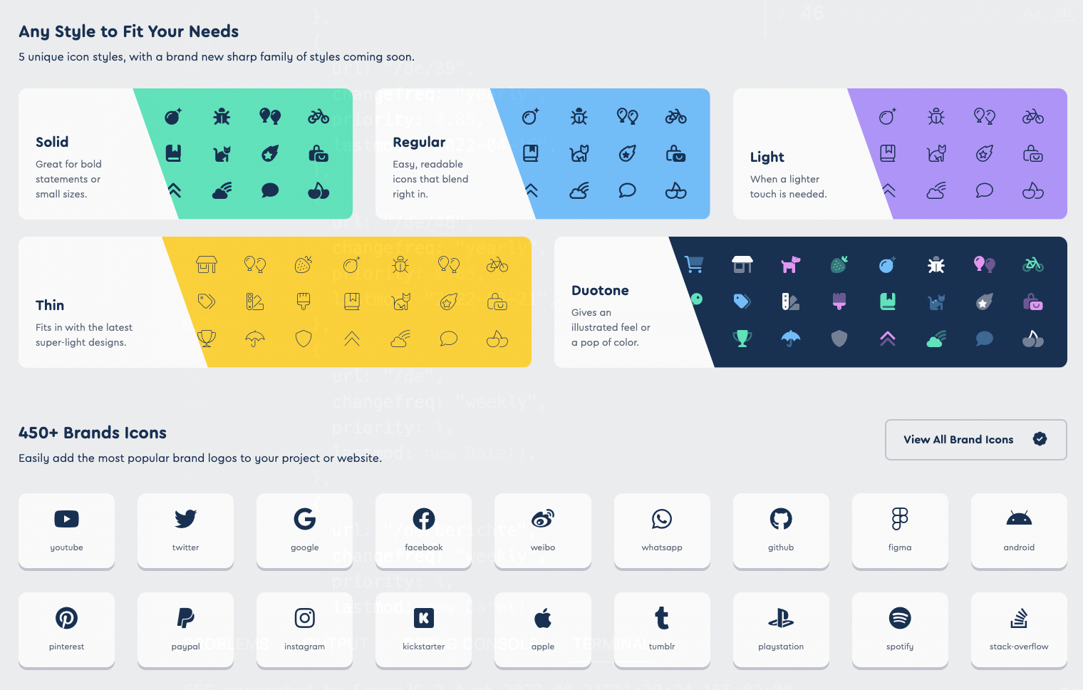
Font Awesome 6 includes 5 icon styles: solid, regular, light, duotone, and the new thin style (plus brands). So each icon is available in 5 styles. In addition, there are brands, which count seperately. All non-brand icons are divided into 68 categories. It makes sense to decide on one style for consistency reasons. In my case, I chose the style solid (abbreviation fas) plus brands (abbreviation fab). If you choose a different style, you should take this into account during installation, configuration and use of the icons as described below.
Installation
First of all, we need the Font Awesome Core Library as a base and the Vue Component Library as an addition, which nicely allows to embed the SVG icons transparently via HTML markup without having to play around with Javascript ourselves.
yarn add @fortawesome/fontawesome-svg-core
yarn add @fortawesome/vue-fontawesome
The NuxtJs Wrapper Library can be imported as follows as a development dependency. With its help, the icon library can be easily configured by hand using a few commands in the nuxt.config.js, as it can be seen in the configuration chapter below.
yarn -D add @nuxtjs/fontawesome
All the free icons themselves have separate libraries per style. Here I choose the style solid icons (one of five styles) and also the brand icons (an additional icon library).
yarn add @fortawesome/free-solid-svg-icons
yarn add @fortawesome/free-brands-svg-icons
Configuration
The configuration in the nuxt.config.js is very simple. We first have to configure the NuxtJS wrapper in the buildModules section inside of nuxt.config.js.
buildModules: [
  "@nuxtjs/fontawesome",
]
Now we import the CSS styles. Please note that the installation of the CSS file is done manually here, as we want to keep our own SASS styles (in global.scss). Note that the order of import plays a role. Your own CSS / SCSS files from the assets folder should then be imported afterwards such that own styles are not overwritten. I otherwise had dubious side effects with my fonts inside the CSS.
css: [
  "@fortawesome/fontawesome-svg-core/styles.css",
  "~/assets/scss/global.scss",
]
Now we configure the library itself.

fontawesome: {
  component: "font-awesome-icon",
  addCss: false,
  icons: {
    solid: [
      "faBars",
      "faArrowDown",
      "faArrowLeft",
      "faArrowRight",
      "faCalendarDays",
      "faRss",
    ],
    brands: [
      "faFacebookF",
      "faInstagram",
      "faTwitter",
      "faLinkedin",
      "faXing",
      "faGithub",
    ],
  },
}
Within the “component” option we can define the name of the Nuxt component in Kebap case. It should be noted here that the "addCss" config option is set to false since we are importing the CSS ourselves. Each used icon from the solid and brands styles is listed here with the abbreviation 'fa' in CamelCase (not fas/fab!). If you select some icons from the Font Awesome Icons Catalog, please make sure to sort them into the correct styles inside the configuration here.
Usage
See, using the icons in Nuxt is very easy as follows.
<font-awesome-icon :icon="['fas', 'rss']" />
<font-awesome-icon :icon="['fab', 'facebook-f']" />
As the "icon" please use an array with the abbreviation for the icon library (fas, fab etc.) and the icon name in kebap case.
You can create a button by adding text and the Font Awesome icon as its content getting the following result.
<button>
  Read more <font-awesome-icon :icon="['fas', 'arrow-right']" />
</button>
Other Libraries (Buefy)
I also use the icons together with buttons from the Buefy UI library. The Buefy library can be integrated with the following config in nuxt.config.js in order to use Buefy elements together with the icons transparently:
buefy: {
  css: false,
  defaultIconComponent: "font-awesome-icon",
  defaultIconPack: "fas",
  materialDesignIcons: false, // weitere Icons
}

A button for scrolling down can be integrated as follows, for example:
<b-button
  size="is-large"
  icon-pack="fas"
  icon-left="arrow-down"
  @click="scrollDown()"
>Scroll down</b-button>
I have integrated a link to Facebook in the navigation, e.g. as follows:
<b-navbar-item tag="a" href="https://www.facebook.com/{USERNAME}“>
  <font-awesome-icon :icon="['fab', 'facebook-f']" />
</b-navbar-item>
That's it. Have fun with your icons.